 How the wwWebTabControl works
The wwWebTabControl allows you to create large content on a single page and mange that input more efficiently via separate tab pages. This control works on the client side and simply allows you to enable and disable display of each of the page, but all content that loaded when the page initially starts. All content is live on the page.
To use the control involves two steps:
- Create the Container controls that hold your separated content
- Create the TabStrip and configure the tabs and visual layout
Create your Content
The first and most important step is to create your content that you would like to display and separate it into separate 'pages' in a way that makes logical sense. You can use any HTML element like <div> tag or use Web Connection containers like a wwWebPanel. <div> tags tend to be easier in this scenario since you can simply reference their ids.<!-- optional style definition for the tabpages for a consistent look -->
<style type="text/css">
.tabpage { width: 500px; height: 350px; border: solid 2px navy; background: #eeeeee; }
</style>
...
<div id="divInfo" class="tabpage">
<h3>Here's Page 1 Content</h3>
Lorem ipsum dolor sit amet, consectetuer adipiscing elit. Integer dictum bibendum nisl. Nam turpis nulla, dictum vel, feugiat eget, scelerisque in, nisl. In ornare venenatis urna....
</div>
<div id="divSelection" class="tabpage">
<h3>Here's Page 2 Content</h3>
Lorem ipsum dolor sit amet, consectetuer adipiscing elit. Integer dictum bibendum nisl. Nam turpis nulla, dictum vel, feugiat eget, scelerisque in, nisl. In ornare venenatis urna....
</div>Ideally you'll want to set up each of these <div> containers right on top of each other so that they all display in the same place if all but one is actively visible. The wwWebTabControl will essentially make all but the selected container invisible when a selection is made.
Once you have the content you can now use a wwWebTabControl to handle the selective display of each of these containers. Typically you'll want to create the tab control right above the first <div> tag. You can drag and drop the wwWebTabControl from the toolbox onto the page.
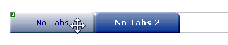
The initial control dropped looks pretty plain:
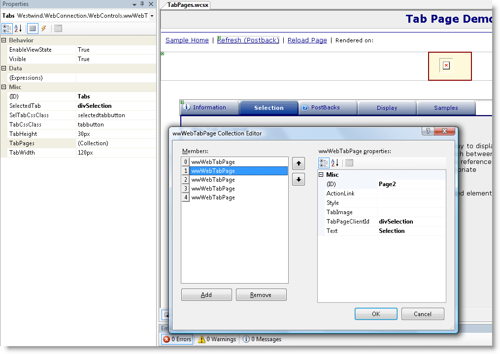
With the control on the page you can then use the designer to set properties on the wwWebTabControl itself and add individual TabPages:
Of course you can also create the markup manually if you choose. Here's an excerpt:
<ww:wwWebTabControl runat="server" id="Tabs"
                    SelectedTab="divDisplay" >
    < TabPages>
        <ww:wwWebTabPage runat="server"
			TabPageClientId="divInfo"
			Text=" Information"
			TabImage="images/info.gif"
			Style="text-align:left" >
		</ww:wwWebTabPage>
		<ww:wwWebTabPage runat="server"
			TabPageClientId="divSelection"
			Text="Selection"
			TabImage="">
		</ww:wwWebTabPage>
		...
    < /TabPages>
</ww:wwWebTabControl>

<div id="divInfo" class="tabpage">
... content here
</div>
<div id="divSelection" class="tabpage">
... content here
</div>
The key things you'll need to set on each TabPage are:
- The ID of the tab page which is the server side ID for the control - used for accessing the page by ID
- The TabPageClientId which maps the tab page to a <div> (or other) HTML container to activate
- The Text for the Tab caption
The ActionLink Property
Of these optional properties the ActionLink is the only one that's somewhat important: By default ActionLink is empty (or 'default') which provides the default behavior of trying to swap pages when clicked. You can also provide javascript:SomeScriptCode(); to execute client script in response to a tab click. Note that you can use the ActivateTab('divPage1') or ActivateTab(0) to activate a tab using client code. Finally you can also specify a URL - if you do the tab click will automatically navigate to a new page.Posting Back and SelectedTab
The tab control uses SelectedTab property to hold the value of the selected tab between postbacks. You can initially assign a value to the SelecteTab property which selects the appropriate page when the control loads. Once you post back to the same page the current page selection is saved and restored when the postback returns. If for whatever reason you need to override this behavior simple set SelectedTab in your page level code:FUNCTION OnLoad()
this.TabControl.SelectedTab = "divPage1"
ENDFUNCThis will override the behavior.
Manually creating and removing Tabs
The tab control can also be controlled programmatically from the server. To add tabs:
this.TabControl.AddTab("Page 1","default","divPage1")
this.TabControl.AddTab("Page 2","default","divPage2")
this.TabControl.SelectedTab = "divPage2"
To delete tabs you need to use the TabPages wwCollection class directly and you have to remove items by their page index.
this.TabControl.TabPages.Remove(2) && Remove 2nd pageRemember removed tabs will return on subsequent hits so whatever logic you apply for tabs that you've removed you'll need to check for this logic each time and appropriately allow or remove the specified tab page.
Controlling Display
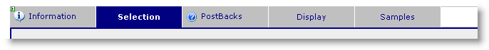
The Tab Control's display is determined by a couple of CSS classes - tabbutton and selectedtabbutton by default, which are defined in westwind.css. The default tab classes use background images for the tab display and these images are stored in the images path of a default Web Connection installation.You can of course customize the style used or create a new one and change the default class used. When setting up a tab style check out the existing one to get an idea of how to best set up a new CSS class. Stick with a fixed size if possible and use contrasting colors for the normal and selected tabs. Images are nice but not required - if you like you can simply have square tabs by using plain background colors that have no dependencies on images:
Plain but quite workable as well. Of course you can create any custom images you choose and use them as background images as well. Simply create 3 kinds of tabs: Normal, Selected and (optionally) Hovering and then create styles that use these background images.
JavaScript Client Activation of Tabs
Tabs can also be activated on the client by using the ActivateTab() function that is rendered into the page. You can activate tabs by their control ID plus either the caption or tab index in JavaScript code:ActivateTab("TabControl1","Tab Caption")
ActivateTab("TabControl1",2)
Instead of the name you can also pass the DOM element.A few Tips
Container Placement
Remember that the tab control is basically just a tab strip - it doesn't contain any content itself and all containers managed by the control are visible in the designer. Remember to place all the containers right next or on top of each other without any other HTML between them so they will render directly underneath the tabstrip.
Use Fixed Width Containers
Tab pages look best if the container that displays content is a fixed size, rather than jumping all over the place for each different content page. Pick the size for the largest page and then use a CSS Class to define the size of the container if possible. Then use that same CSS class for all the page as done in the example above.
Frame and Tab Matching
It helps if you make the frame or top area of your content the same color as the bottom of your selected tab. This makes the selected tab seem to bleed into the content area and gives even more indication of the selection.

Comment or report problem with topic